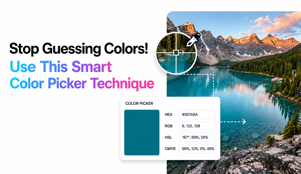
Selecting the appropriate color scheme is an essential step in any design procedure. Whether you are creating a website, crafting a logo, manipulating photos, or establishing brand identity, color accuracy will play an integral role in ensuring that the output looks professionally done and visually pleasing. Sometimes even the slightest differences in shades could alter the look and feel of the entire design.
This is where the usefulness of color pickers comes into play. You won't need to resort to trial and error to find a match or try to estimate colors based on experience. All you have to do is pull out the actual color from an image and work from there.
The extracted color codes could then be immediately utilized in your design project regardless of platform or tool.
The Importance of Design Consistency in Branding
Consistency in design means harmony between all elements used in the design and especially the colors used. Designing according to a cohesive color scheme creates a sense of order and professionalism. Consistent designs create an identity that people recognize and relate to.
Uncoordinated or random colors create designs that seem disorganized, chaotic, and less credible. Conversely, when you use harmonious colors in your design, you create an experience that is more appealing and organized. All elements will be cohesive and will be working towards creating harmony within the design.
Using a balanced color scheme also provides some critical advantages for designers. First, it makes it easier for users to find their way through the content in the design. Secondly, it creates a brand identity by ensuring that the same colors are used throughout different mediums. Thirdly, a coordinated color scheme creates an emotional bond with the audience because the colors match the message. Lastly, it creates engagement within the content and directs the audience's eyes where necessary.
How Modern Tools Make Color Discovery Easy
Previously, color selection required the use of cumbersome processes like tweaking the value using a slider, multiple sampling of the same color until getting the desired shade, or even guessing the values. Not only did this approach take quite some time, but it could also result in errors. It would be difficult to get the exact shade from an image or any other source.
With the introduction of color picker online tools, this process has been completely revolutionized and made simple. Designers can now quickly extract color codes and use them in their designs without spending too much time trying to guess or sample different values.
Upload an Image: The very first thing one must do is upload the picture they want to extract the color codes from. It could be a photo, UI screenshot, graphic illustrations, or even an image used by a company for brand identity purposes. The image will then go through analysis and preparation for color pick-up at the pixel level.
Hover and Click on a Shade: Once the image is uploaded, all one needs to do is hover their mouse pointer over the image. As every single pixel on that image can be used to click and pick the color codes, one can select the color code from anywhere they want and there will be no confusion at all.
Instantly Get HEX or RGB Codes: The moment you pick up your desired color, it will automatically produce the hexadecimal code or RGB value. These are commonly used for creating digital designs. You don't have to go through the lengthy process of manually calculating the codes since the software takes care of everything instantly. In this way, there will be no difference in colors when used on different devices.
Reuse Colors Anywhere: The color can now be used anywhere you like after copying the code. You may apply it within various design spaces, including CSS styling, user interface components, brand guidelines, social media posts, etc. You won't have to spend extra time choosing and verifying colors again and again since you can use the identical colors at any point. With automation of color picking, modern tools save a lot of time and effort by streamlining the entire process.
Color Wheel Insights for Better Design
Apart from the numerous options for customizing colors available in the modern-day color palette applications, most of them come with an integrated color wheel, which is helpful for comprehending color combinations. The color wheel does not involve guessing when selecting the perfect combination of colors but rather uses a scientific and creative method of making a harmonious color palette.
The color wheel works on the basis of the color theory, which involves placing all colors on a circle according to their relationships. This enables users to comprehend the interaction between various tones and use them appropriately in their designs.
The color wheel can assist you in:
Find complementary colors: Complementary colors lie opposite to each other on the wheel. They are known for high contrasting effects and create eye-catching designs. It comes in handy if you wish to emphasize certain components of your app, such as CTA blocks or buttons.
Find analogous and matched tones: Analogous colors appear next to each other on the wheel. They provide a smooth transition from one tone to another which makes your design more harmonic and attractive. An analogous combination can be applied to UI backgrounds or gradients.
Create harmonious color palettes: A perfect palette guarantees that none of the colors will stick out. With the help of the color wheel, one can achieve harmony among primary, secondary, and accent colors.
Improve visual contrast: Contrast is very important in readability and usability terms. The use of the color wheel enables one to be able to pick out those pairs which have sufficient contrast between such features as text and background. If you decide on a main color, then this system can instantly find suitable colors for it based on harmony laws.
Common Mistakes You Should Avoid
However, despite the fact that picking out the right colors from the picture with the help of special tools is very simple, the quality of the final design will depend on how these colors will be applied. There are quite a number of designers who make some minor mistakes that have a significant effect on the quality of their projects. Here are a few of these mistakes that should be avoided.
1. Using Only One Color Without a Proper Palette: Sometimes, when selecting colors from a picture, people focus only on one color without creating the right color palette for their future design. Though this color itself looks really good and interesting, it cannot be enough. A well-created design should always have primary, secondary, and accent colors included into it.
2. Ignoring Contrast and Readability: The other common problem is not verifying the contrast ratio between design elements such as text and background colors. Although some colors can be visually pleasing individually, they may become challenging to use when placed side by side. High contrast ratios enhance visibility and usability by making information more readable in different settings and across multiple platforms.
3. Using Color Combinations Without Testing: Another mistake designers make when using colors in their projects is selecting color schemes that look great independently without checking how they complement each other when used in the same design. Some colors can be visually pleasing individually, but they may clash when combined in designs, creating distractions for viewers.
4. Ignoring Device and Screen Variations: The problem of color inconsistency arises due to the differences in various devices' screens. While the shade chosen may perfectly suit one monitor, on another device it might seem darker or lighter, or just completely washed out. Therefore, it should always be tested on several screens to ensure the same visual result on each of them.
5. Overusing Too Many Colors in One Design: Another major blunder in color choice is overusing a lot of colors within a design. Having too many competing color shades in one composition makes it hard for the customer to pay attention to something. An adequate number of colors will bring professionalism and neatness into the design. Moreover, it will positively influence brand identity.
Read More: 5 Simple Ways to Pick Perfect Colors from Any Image
Conclusion
The use of a color picker tool goes beyond that of a mere utility. This is because it acts as a creative tool which assists the designers to make smart and accurate decisions regarding colors to be used. The process of picking exact colors from any photo will lead to enhanced accuracy and speed during the design process, as well as ensure consistency in all types of creative works. This ranges from designing for web pages, brands, UX/UI, to marketing visual works.
The use of this particular tool makes it possible for one to extract colors in hexadecimal and RGB formats and comprehend their relationship with the use of a color wheel. It makes the process of selecting colors more accurate by ensuring full control over the palette used. By using such a tool, it becomes easier to achieve effective results within less time.
Resize The Image is more than a mere image resizer, but a fully-fledged image editing tool that can help one resize and optimize photos effectively.